
AJ's Landscaping
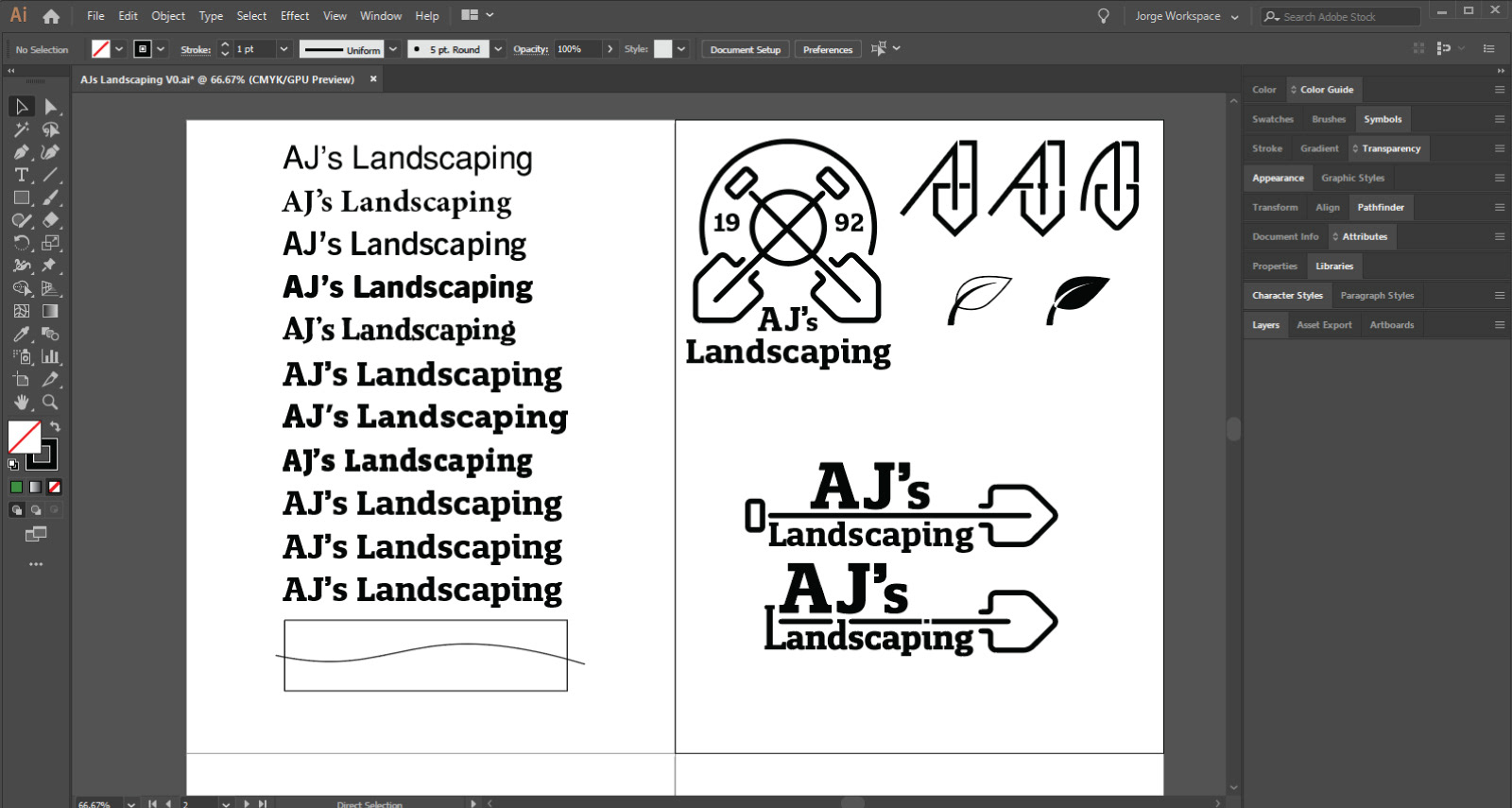
A friend of mine approached me to help redesign her family member's business logo. The original logo featured the company's name arching over a green hand giving a thumbs up with a leaf circling it. They gave me complete artistic freedom to develop the new logo so I began by brainstorming ideas on sheets of paper. I often find myself fixated on the initial concept of a logo; however, I challenge myself to keep playing with various iterations. What's vital is getting as many ideas out as possible without concern of making it perfect. From there, I like to go through elimination rounds by discarding certain versions deemed unaesthetic or inappropriate for the specific company product and service. Once I have a couple ideas the client and I like, I combine certain elements and repeat the process all over again. Eventually, a great design reveals itself. Finally, I polish it up by fixing intricate details like spacing, alignment, and edges.
Creative Process
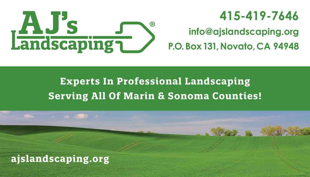
For this particular logo, I wanted to ensure it was legible from afar and memorable so potential customers could recall it immediately. I accomplished this by incorporating an icon of a shovel to represent work. The typeface I used is Quatro Slab to match the font used on the company's existing website. It originally had sharp edges which I rounded to make it appear more inviting. Additionally, I adjusted the height of the characters in alignment with the shovel icon. Since icon and word "Landscaping" takes up a lot of space, I increased to size of "AJ's" to balance it out. This form of hierarchy makes "AJ's" stand out but doesn't grab too much attention from the logo's components.