
Bounce Table Tennis
I was given the opportunity to design a logo for a table tennis company specializing in gear for youth and entry level players to the sport. I reported directly to the founder and his business partner — a professional table tennis player from China who has trained U.S. Olympic team members. They granted me complete artistic freedom to develop the logo so as long as it met the following criteria:
1. Must be versatile and transcend table tennis itself to adapt to future business expansion.
2. Must be simple and memorable.
3. Added bonus to feature something hidden within the logo.
4. Must convey a sense of energy and fun.
1. Must be versatile and transcend table tennis itself to adapt to future business expansion.
2. Must be simple and memorable.
3. Added bonus to feature something hidden within the logo.
4. Must convey a sense of energy and fun.
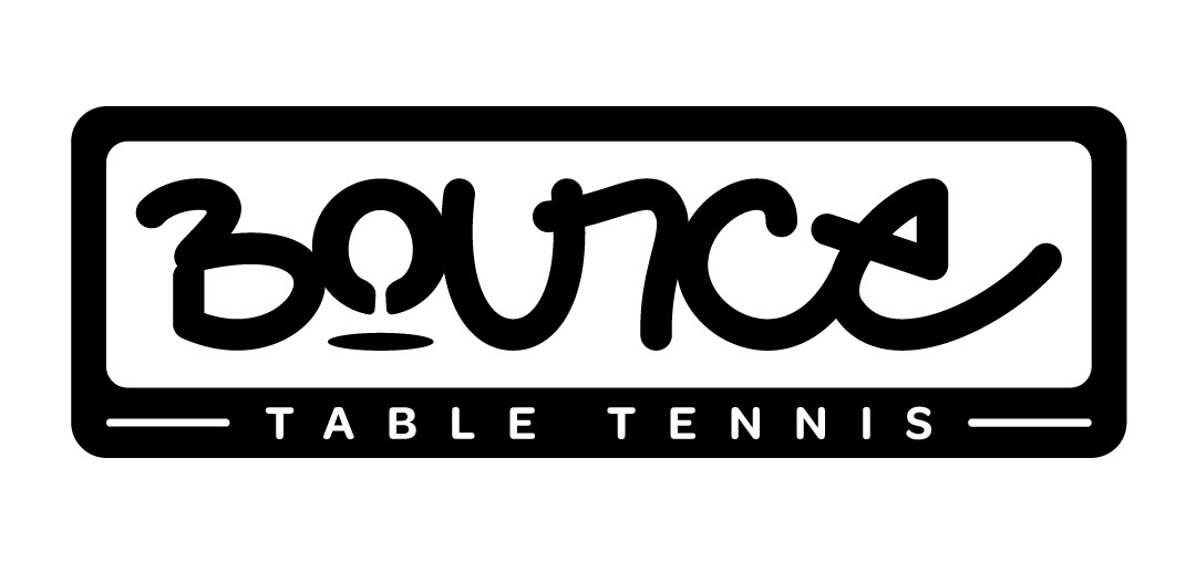
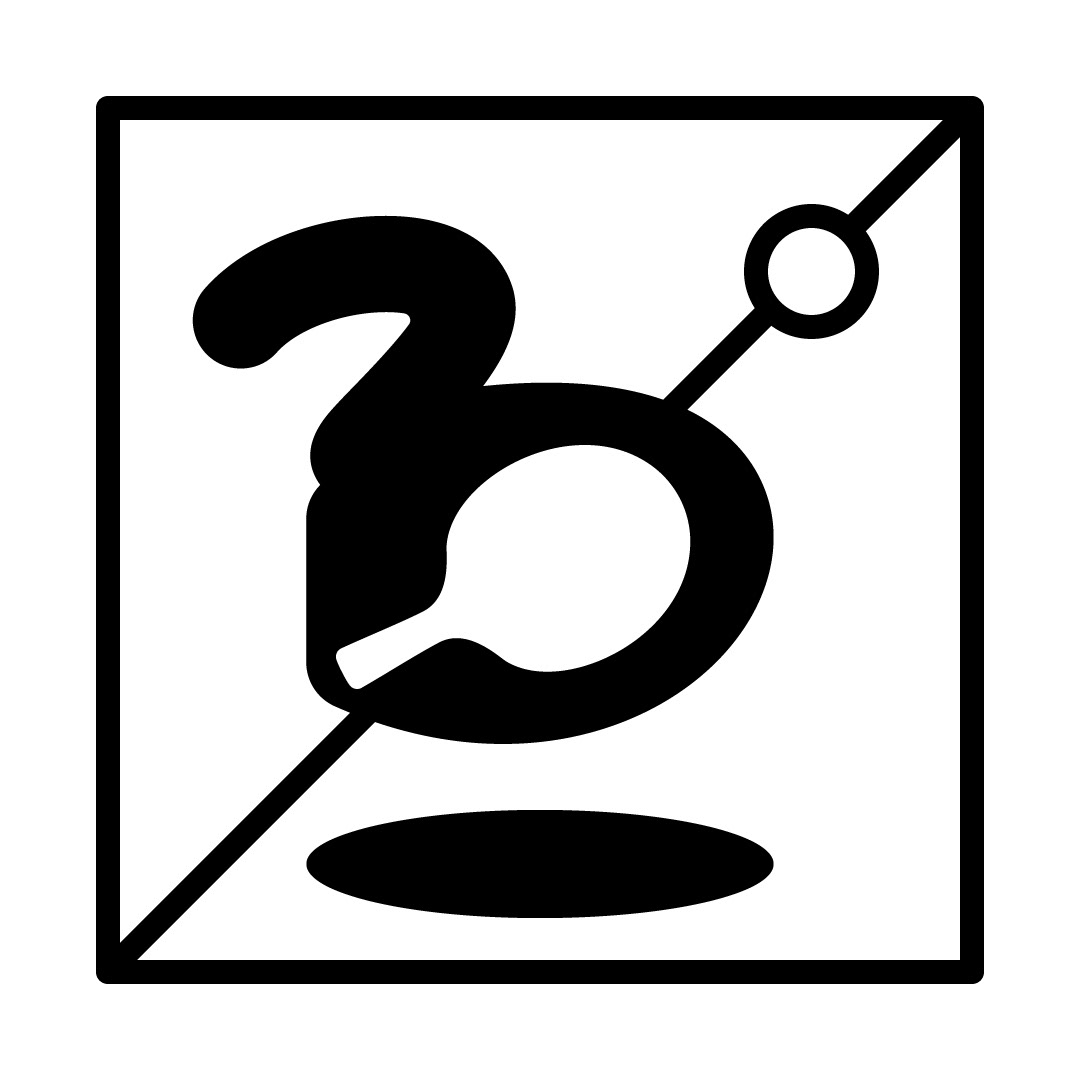
After researching various table tennis companies, organizations, and non-related fields, I designed the logo displayed below. I wasn't satisfied with any existing fonts that "conveyed energy and fun" so I sketched it out by hand. I went through multiple iterations by combining letters that looked pleasing and legible to the eye. In regards to the hidden feature, I incorporated a silhouette of a ping pong paddle as the counter of the letter "O". Although I received positive feedback, the two main critiques were that the logo was too ping pong centric and that it resembled a competitor's logo. So I went back to the drawing board.
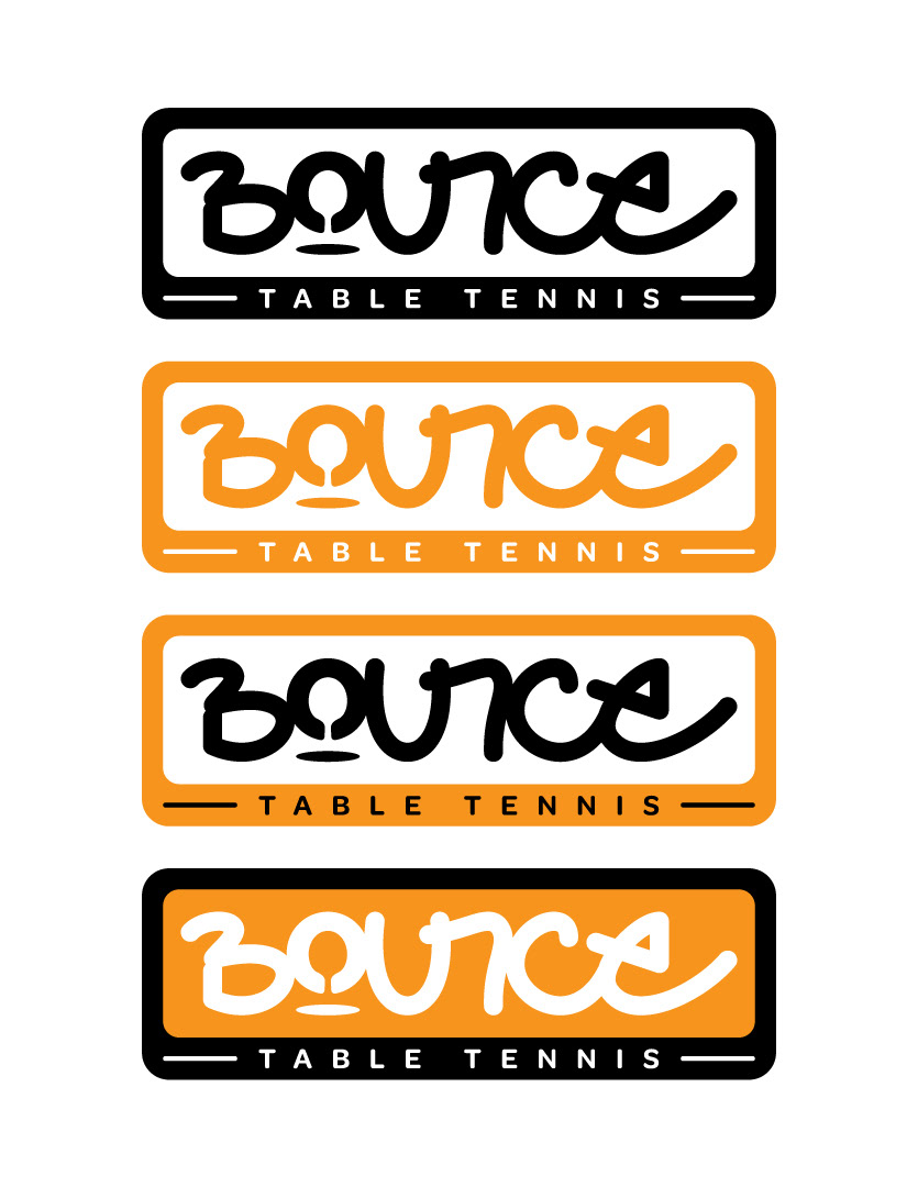

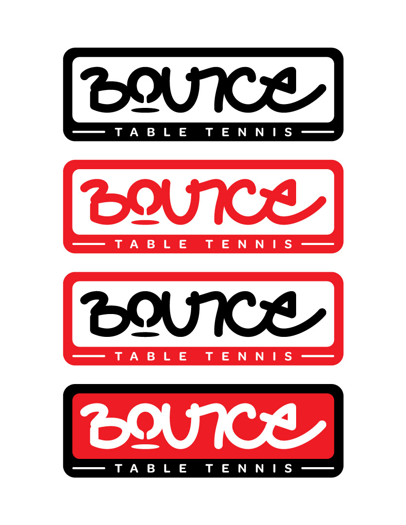
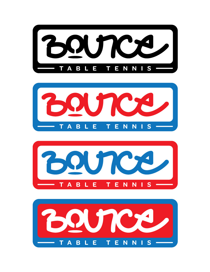
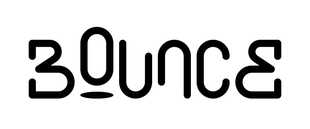
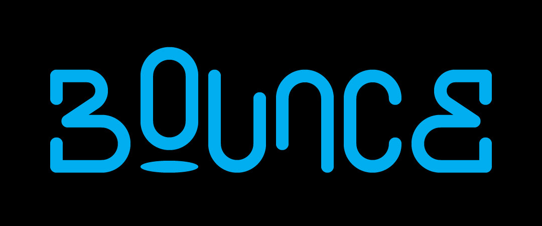
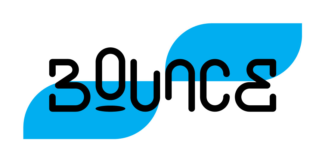
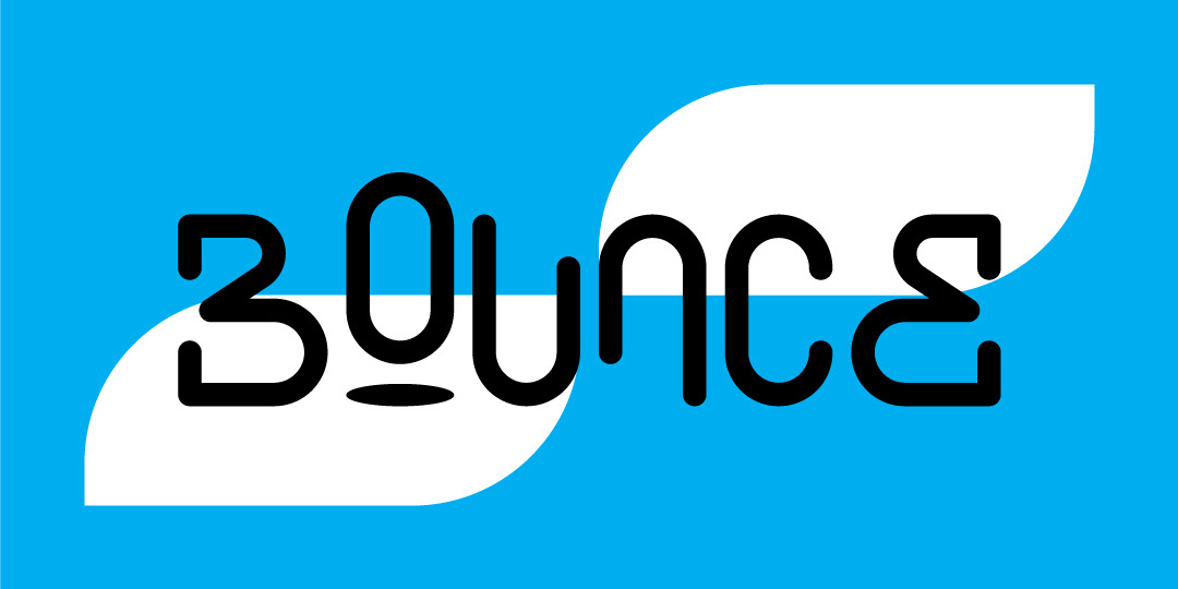
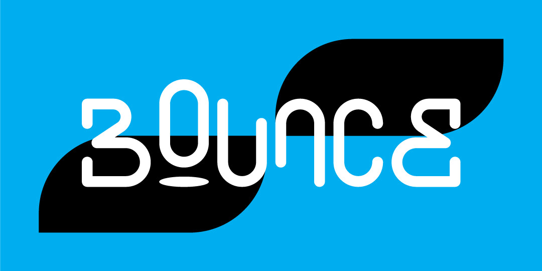
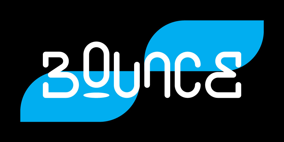
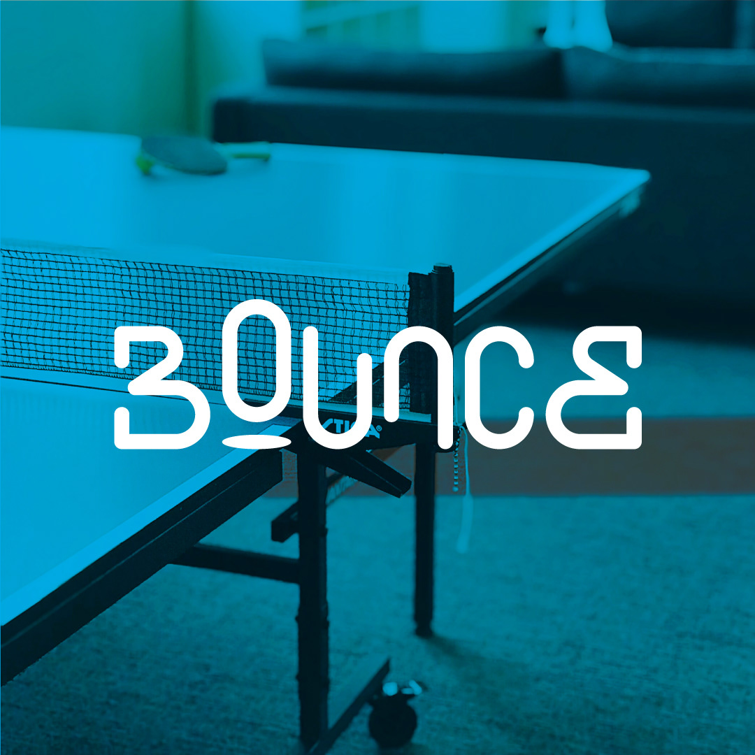
Revision
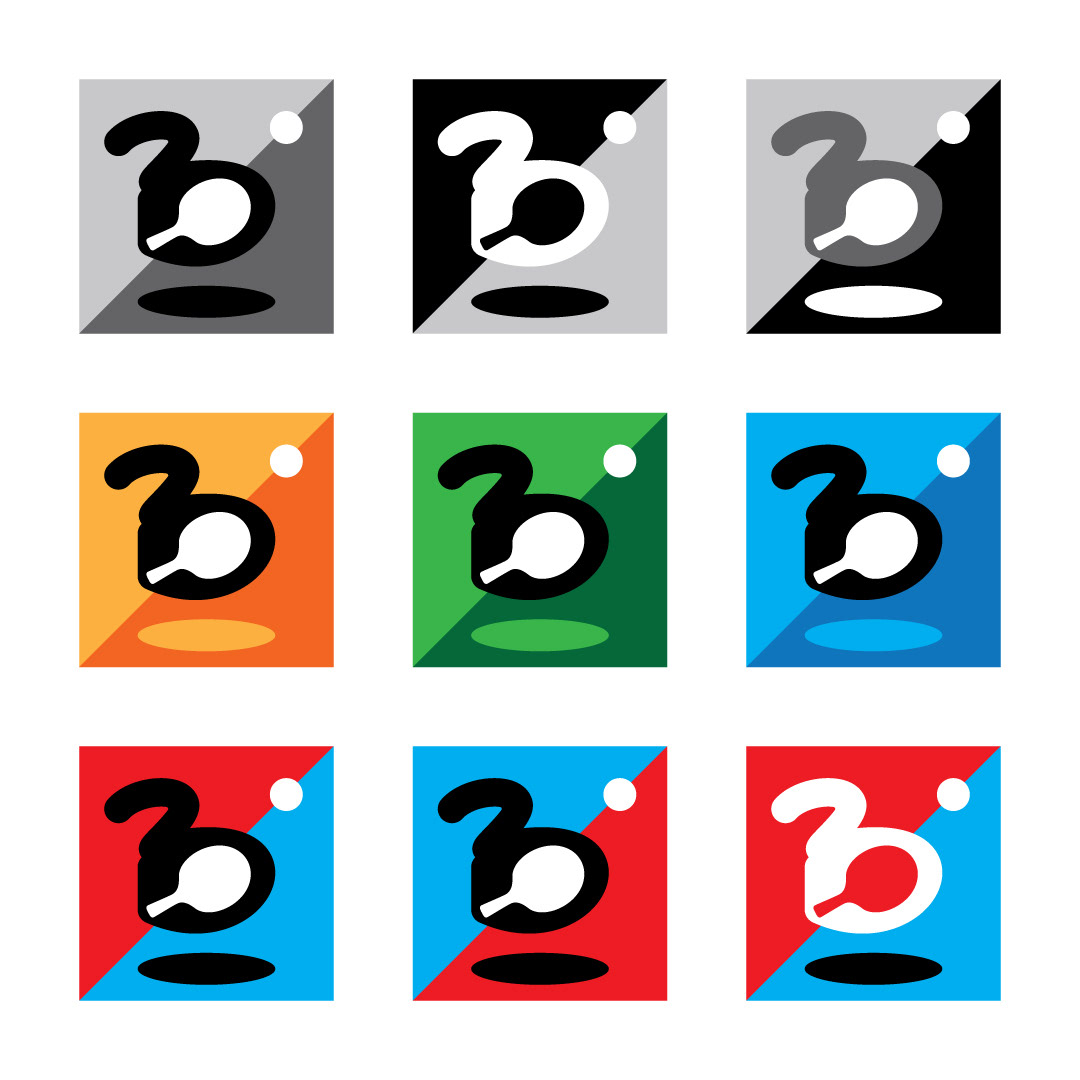
The revised version of the logo displayed below was designed with consideration of the 4 criteria initially given as well as the feedback I was given from the first round. This wordmark logo was simplified to make it adaptable for various sports, not just table tennis. I made the word "Bounce" symmetrical while simultaneously insinuating movement with the shadow beneath the "O" and reversing the "U" and "N". It's also worth mentioning that I created the letters by hand.