
Briotech
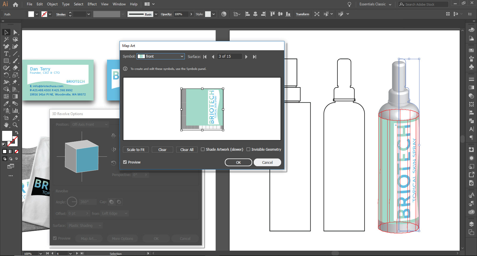
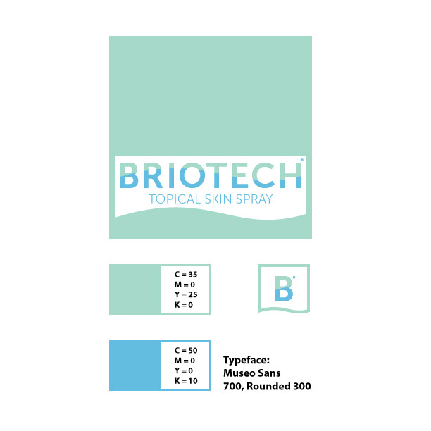
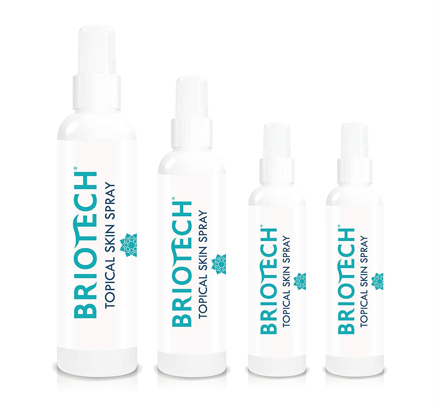
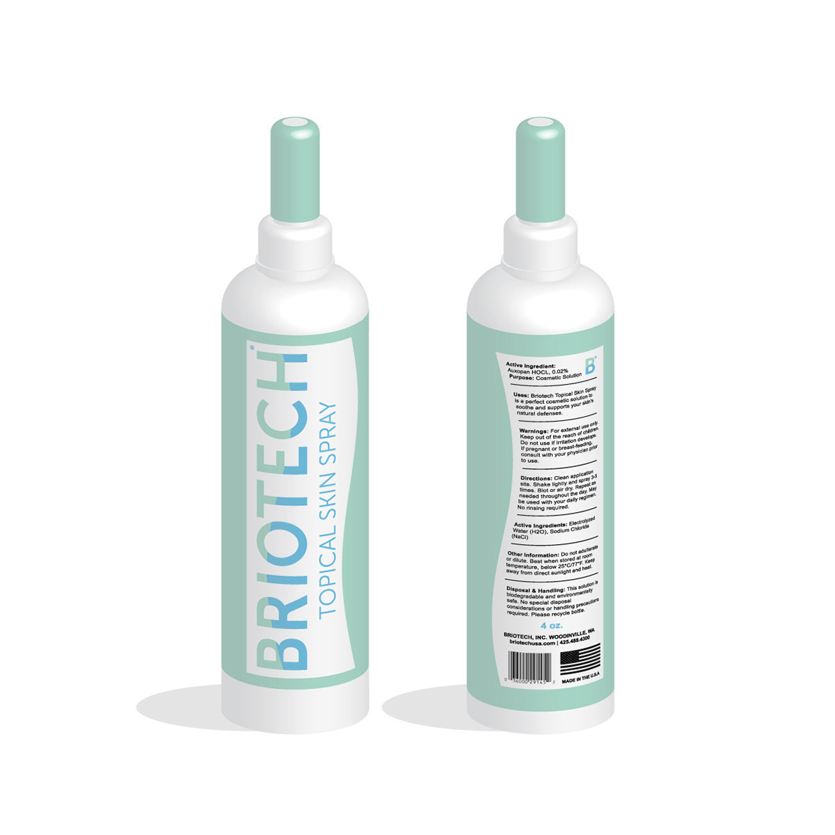
As part of a Marketing & Sales Management course, I was assigned with re-branding collateral for an existing business that specializes in skincare through organic and non-invasive treatment. Working in a team of three, we conducted research of the company and marketing strategies to boost their presence and sales. One of the most apparent issues I took note of was that their packaging lacked visual properties to make it stand out on store shelves and on online markets. I began by taking existing elements of their original logo and incorporating them into the revision. Briotech's original logo contained a wave as part of the top bar of the letters "T" and "E". The wave now spans the entire word mark and margins of the logo and product information. Blue and turquoise was selected after surveying 200 people regarding changes to the brand. Based on the survey, I also made sure to incorporate more color around the bottle to make it distinguishable from afar. The 3D rendered model was created using Adobe Illustrator's 3D revolve tool.